“If you look at Google Earth, it’s springtime everywhere,” explains Gopal Shah, Google Earth’s product manager, in a YouTube interview. In a TED talk he boasts that Google Earth is “cloud-free,” since the clouds and their shadows are edited out. “I like to think of this as Mother Earth’s best selfie,” he says, smiling indulgently. He pauses, as if waiting for the audience to laugh. But if Google Earth is the world’s selfie, does that make Google — the company taking the picture — into the world’s self? And how is this self and that selfie affecting the perceptions of our planet?
Though Google Earth may seem like a straightforward representation of the world as it is, it is actually made by stitching together millions and millions of pictures from various sources —satellites, planes, trekkers, cars — produced by Google itself or third-party suppliers. The result is not an objective mirror, as its seamless presentation in the Google Earth interface can make it appear, but a construction shaped by the countless decisions of humans and the algorithms they have programmed. The default images shown on Google Earth, for example, are not necessarily the most recent ones. Rather, it displays what it regards as the best imagery for each location, though the criteria for this are not disclosed.
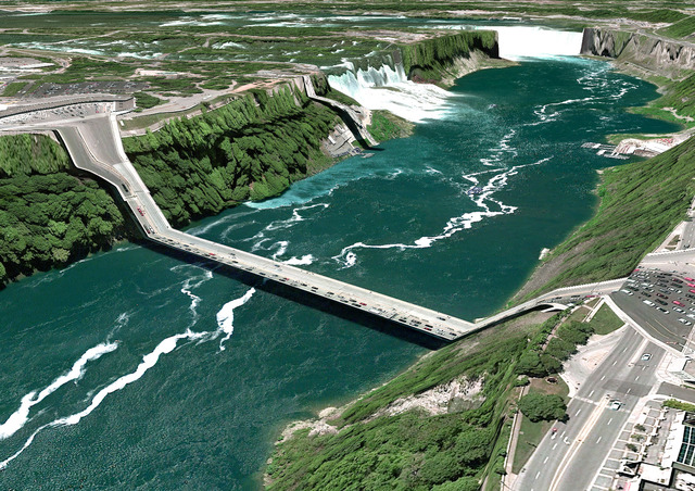
Google Earth is governed by a certain smoothness that makes the representation seem plausible as Earth’s replica
Judging by what the app shows us, these decisions are governed not by an essential demand for accuracy but for clarity: for a certain smoothness that makes the representation seem plausible as Earth’s replica. Just as Instagram filters can remove blemishes, plump our lips, and thin our chins, Google Earth filters its representation of our planet, digitally nipping and tucking unpleasant weather patterns, harsher seasons, and the nighttime hours to render Earth as budding, healthy, and predominantly green. The version that feels “real,” that we’d prefer to be real, is not the one that is verifiably accurate but the one that’s easiest to consume, the one whose concerning blemishes have been fixed.
Earlier versions of Google Earth had a patchwork aesthetic that made its underlying constructedness more apparent: Images were visibly stitched together and colors were not quite aligned; there were rendering glitches and anomalies such as collapsed bridges and roads, collected, for instance, in screenshots by artist Clement Valla. “These jarring moments,” he argues in an essay for Rhizome, “expose how Google Earth works, focusing our attention on the software.” But in the 15 years since Google Earth’s launch, the company has worked to efface such evidence, overriding anomalies with a smoothed-out representation that masks the sources and the contexts in which images have been acquired and selected, meshing them into giant collage of renders and real-time images. As Valla explains, Google uses the Universal Texture — a mapping technology invented and patented by Google that allows it to extrude 3-D surfaces and models from two-dimensional images — to achieve this smoothing; he suggests that the company’s software and algorithms privilege the cloudless images that yield more realistic results. But this realism is not simply empirical.
As its name implies, the Universal Texture promises a god-like (or drone-like) uninterrupted navigation of our planet — not a tiled series of discrete maps, but a flowing and fluid experience. This experience is so different, so much more seamless than previous technologies, that it is an achievement quite like what the escalator did to shopping.
The smooth, uncanny constructions are designed to facilitate an endless consumption of the earth, much like the escalator carried shoppers frictionlessly through a mall.
Cumulatively, the selection of millions of “best” images on these terms creates an overall distorted representation of Earth. In making smoothness the underlying design principle of Google Earth, Google risks denying the bleak realities our world faces. In 2014, two years after Hurricane Katrina had left a wake of destruction across the southeastern U.S., Google defaulted to pre-Katrina imagery for Google Earth, which some critics described as “airbrushing history.” (Google eventually purchased more up-to-date images to use as the default.) Similarly, as artist Tamara Kametani’s The Sea Stayed Calm for 180 Miles documents, Google Earth’s real-time viewing software shows the strip of ocean between Libya and Lampedusa as peaceful waves, but this “real-time” footage is, in fact, an animated rendering that significantly reduces Google Earth’s processing load. In this case, a programming hack falsifies the representation of the world’s deadliest migration route.
But Google Earth’s denial of the planet’s crises is not limited to erasing evidence of climate change — indeed, its Voyager feature even offers guided tours such as “See Climate Change’s Impacts” which includes pit stops at the sites of burning forests in Indonesia and melting glaciers in Chile. It happens through encouraging users to see the world as theirs for consuming.
“Everybody believes that when they are looking at a map, particularly a modern map, that they are looking at the truth,” Peter Barber, the former head of maps at the British Library, said on the BBC Radio 4’s Mapping the Future podcast. Yet, as Barber explains, a map is “a selection from the truth tailored to the requirements of the user and reflecting the values of the society in which it is produced.”
This logic of tailored mapmaking is quite clear when one looks at Google Maps, which foregrounds consumption and consumerism by highlighting the shops, restaurants, bars, and tourist attractions nearby. It positions us as consumers in a world full of places to spend our money and orients us to move through locales in this way.
If Google Maps supports and fuels consumerism, what sort of user and which values does the planet’s “best selfie” convey? Google Earth initially grew out of a company called Keyhole, which Google acquired in 2004, that developed mapping software used to simulate bombing raids in Iraq. According to this report in the Guardian, Google still likely sells versions of Google Earth and its data to “just about every major military and intelligence agency.” This suggests that at least some of the embedded values of Google Earth include viewing the planet as fundamentally a site of struggle for territorial control, and mapping as a strategic means for securing subordination and subduing resistance.
Yet publicly, Google has shifted the focus of Google Earth’s marketing toward the desktop tourist, who is presumed to have a different sort of conquest in mind: to be able to approach the planet as an object of consumption they can explore unilaterally at their leisure. In 2017, Google launched an update of Google Earth accessible in Chrome (rather than as a stand-alone program). For this version, the company, according to engineering manager Sean Askay, was “starting with more of a consumption experience.” Google Earth was presented as a kind of entertainment platform replete with media partnerships and the Voyager feature that allowed users to “climb Mount Everest, swim with sharks, or visit Afghanistan with Zari the purple Muppet.” When you complete the phone installation of the Google Earth app now, the final screen reads, “The Earth is yours, go explore.” It’s as though you have suddenly become a consumer of Earth rather than one of its inhabitants.
Google’s “Universal Texture” facilitates an endless consumption of the earth, like the escalator carrying shoppers frictionlessly through a mall
Architect and critic Mark Dorrian has argued that Google Earth’s “interface works through a principle of grasping, which intensifies the sense of the manipulability of the virtual object: through the hand icon that appears one can ‘take hold’ of the earth and spin it, or even invert it, which is a strangely disconcerting experience at first.” This god-like power dynamic, too, reinforces a sense of our separation from the planet we consume. This was perhaps a useful distancing for Google Earth’s military clients, who could operate at a remove from potential consequences of their actions. But for general users, it offers an equally false sense of autonomy over and separation from Earth, which occludes our ability to see the sorts of collective action necessary to reverse the disasters we face.
As Covid-19 lockdowns were shuttering citizens indoors in April, for instance, Google Earth seized on the opportunity to launch a slew of themed virtual tours (e.g. the National Parks of the United States tour). It made Google Earth accessible in all browsers and added 2,500 new images to Earth View, a spinoff showcasing surreal and awe-inspiring landscapes from above. For all the feeling that Google Earth’s could be a helpful resource for learning about the climate crisis, its interface of zooming in and out and around the globe seamlessly in high-definition undermines its potential. The form comes to contradict the content: We may revel in the beauty and awesomeness of seeing the earth from the sky — and our ability to freely manipulate this view — despite the crises the imagery may depict. Deforestation on a devastating scale can take on the same aesthetic as any other “virtual holiday” on Google Earth.
In fact, the effects of the climate crisis may be even more aesthetically pleasing than the average landscape when viewed from the sky. Toby Smith, a photojournalist and the senior program lead at Climate Visuals, suggests that “human activities like mining or deforestation leave quite sexy and attractive patterning, scarring and infrastructure which looks amazing on satellite photos — disproportionately good, compared to how a naturally preserved landscape does. For example, if you look at the areas of the Amazon that haven’t been destroyed yet, it’s all just green. It’s very difficult to promote that climate solution of ‘don’t touch the green carpet’ through aerial imagery.” Although Climate Visuals researchers have not specifically conducted research into the efficacy of aerial photography, they have found that the most impactful images for changing behavior around climate change include humans, are local, and tell new stories — characteristics that are entirely absent from aerial photography.
Aerial images can be helpful for conducting research — Google Earth and other satellite-imagery repositories like NASA and Landsat (which are more up to date) are useful for tracking ecological change — but they offer little in the way of rhetorical power. As Dorrian notes, “scintillating images of the beauty and diversity of the earth’s surface, of extraordinary definition and reproduced with highly saturated colors, achieve a kind of hyper-reality that appears simultaneously abstracted and highly palpable and that sublimates both pristine and devastated landscapes alike.” The public’s will to act on the visual information conveyed about planetary destruction is neutralized by the touristic and consumeristic affordances of the map, which may placate us with the feeling of having been entertained. In an article for the New Statesman, India Bourke describes this as “tourism for the Trump Age,” which focuses on consumption through “a world surveyed at a safe and sanitizing distance.”
Google Earth’s commodification of the planet is part of a long legacy of extracting resources from the Earth for profit, only it performs its extraction through digital representation. It encourages people to be entertained by the planet and to feel separate from that legacy of extraction. It also requires a huge amount of energy in and of itself, inviting us to consume the planet in another way. Conservation and consumerism can never be compatible bedfellows.
In The Society of the Spectacle (1967), Guy Debord writes:
When the real world is transformed into mere images, mere images become real beings — dynamic figments that provide direct motivations for hypnotic behavior. Since the spectacle’s job is to use various specialized media to show us a world that can no longer be directly grasped, it naturally elevates the sense of sight to the special pre-eminence once occupied by touch.
By participating in the 21st century fantasy of a frictionless existence, Google Earth — a form of “specialized media” that shows us that the “world that can no longer be directly grasped” — treats our planet as a toy, an object of pleasure, an entertainment platform that can be casually manipulated, updated, edited, and enjoyed rather than an unfathomably complex, nuanced and at-risk ecology to be respected. As we smoothly transition from one location to another, Google Earth whispers its hypnotic mantra of “Springtime everywhere. Springtime everywhere” and smooths and soothes us into a strange relationship with our uncanny planet.
This sanded-down, polished, slippery-slide smoothness isn’t exclusive to Google Earth. Within the Smooth Earth there is the “Smooth City” — a term coined by architect and critic René Boer to describe the sanitized urban condition that is becoming ubiquitous, in different intensities, across the globe. In the Smooth City, “public spaces are well-designed, well-maintained, clean and safe, if you conform to the rules … However, it can also be a highly normative, controlling and arguably oppressive environment, in which gradually all opportunities for productive friction, sudden transitions or subversive transgressions have been eliminated.” Inside the Smooth City, one might find Smooth Citizens, who aspire “to become as smooth and impervious” as their devices, as Nikki Shaner-Bradford has described. We also have “Smooth Food,” textureless and surreal, glistening with slimy and jelly-like surfaces, which journalist Jenny G. Zhang describes as “food without bite to it.” Zhang concludes that our attraction to smooth food is a reaction against our unsmooth era: “Smooth food is for when you want to close your eyes and rest your head, senses off, save for the heightened feeling of running your fingertips over the satiny surface of a plane that never ends; it continues, uninterrupted, in all directions.”
The allure and danger of smoothness is in how it placates, mollifies, and sedates us. What is the alternative? I am reminded of the Instagram bio of Yehwan Song, an art director, graphic designer and developer, that reads “Anti-user-friendly.” What would an anti-user-friendly Google Earth look and feel like? If Google’s Earth was friction-full rather than friction-less, how would it affect our perceptions of our planet? What could a Rough Earth do?