
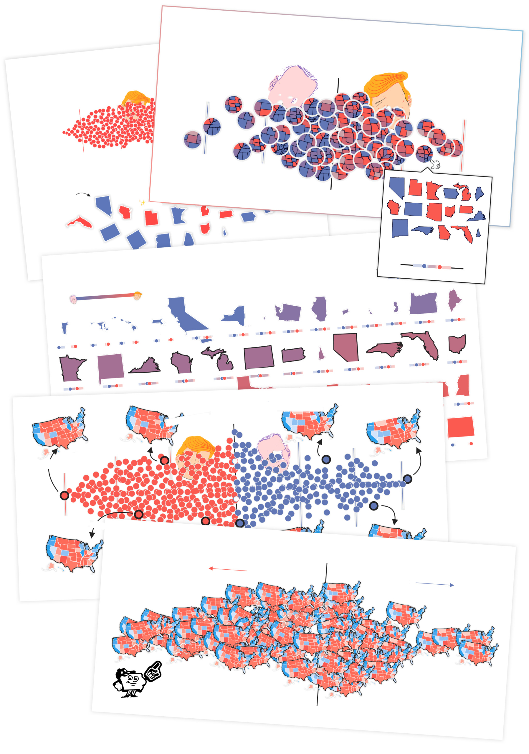
To the individual voter, an election looks like coloring in bubbles with a black magic marker. For the municipalities tasked with summing all those ballots together, an election looks like a list of names, each paired with the number of votes it has garnered. An election, for a county, looks like amalgamating those lists into one that can be passed along to state officials, who log them all together into a grayscale spreadsheet. Only once things go national does the sense of an election as a picture really sharpen. Our woebegone states, all 50 of them, rendered brilliantly in red and blue.
The single day over which this process has traditionally transpired is far from enough for election obsessives less concerned with casting their personal votes than in prognosticating everybody else’s. Luckily for that set, this is a golden age of prolonging the magic. Each new election model follows a line of sophisticated forecasts that have propagated over the last dozen years, and each provides a distinct opportunity to experience elections on a daily basis. Users, it is presumed, can’t get enough of immersing themselves in the aesthetics of prediction and uncertainty: concepts illustrated, of course, in those same contrasting colors that signal history in the making.
Though Nate Silver’s FiveThirtyEight — named for the total number of U.S. electors who actually determine the winner of the presidency every four years — publishes the most well-known of these forecasts, his is far from the only one. In recent elections, the New York Times, Huffington Post, and Daily Kos all hosted their own models, while this year, outlets across the pond have joined in the fun, with both the Economist and the New Statesman rolling out sparkling new forecasts. The election modeling field has grown so exponentially since 2002 — when Real Clear Politics began aggregating polls ahead of that year’s midterms — that it’s now possible to average the models themselves into a “consensus” forecast like the one featured on 270toWin.com.
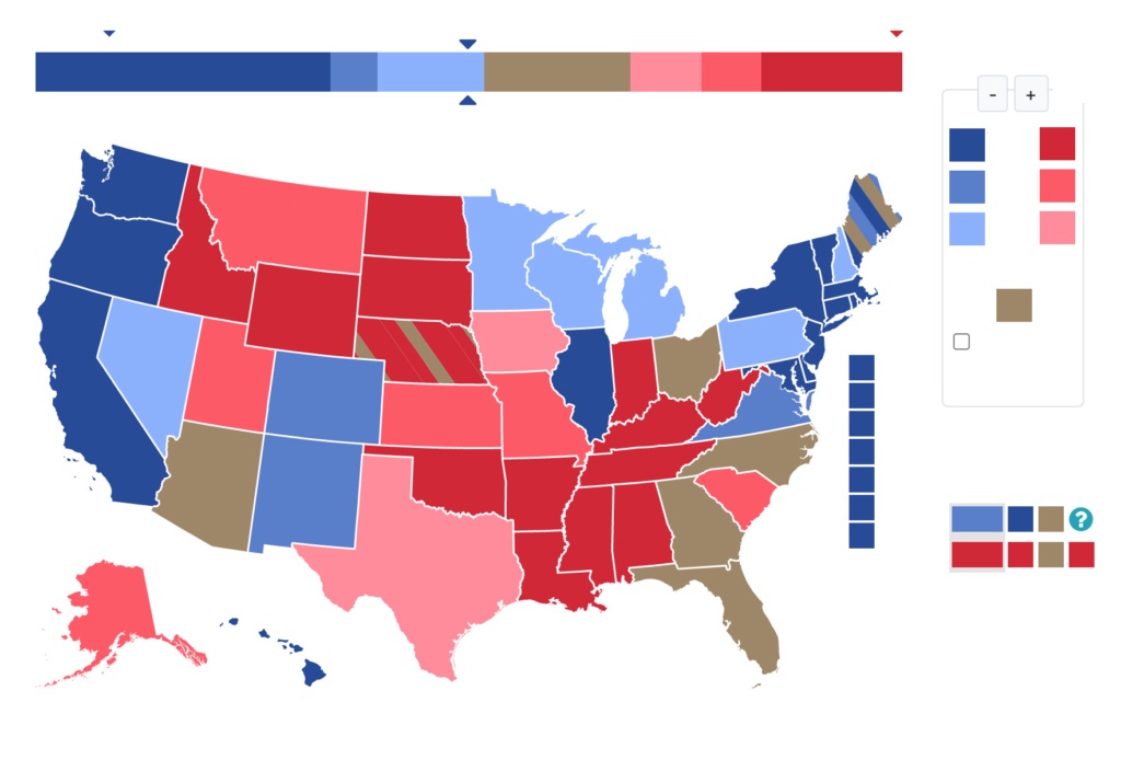
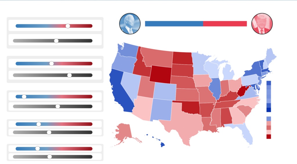
But modeling is just one constituent part of data-driven election aesthetics. The Times’ once reviled election-night needle has become a staple of its coverage, and nearly every news site now reports out election returns at the county level. Just last week, the Cook Political Report debuted the “Swingometer,” a tool that allows users to see how fine-tuning the percentage of voters in each demographic group supporting either Trump or Biden might change the final tally. Nudge the turnout numbers of “white, non-college graduate” up, or “Hispanic/Latino” down, and be amazed as the electoral map gradually tints warm or cool.
As the data grows more complex, the challenge increases for the graphic designer tasked with reconceptualizing all those numbers into one picture. The point of a well-designed building, typeface, concert flyer, or dating app is that it communicate meaning and usability as succinctly as possible — that, whatever ornamentation or embellishment the designers engage, they do so in a way that does not cloud the message.
So just what exactly is so clearly revealed by this year’s forecast graphics? Judging by FiveThirtyEight: complete uncertainty. That’s because Nate Silver, the site’s mastermind, has spent the past four years fending off criticism from less data-savvy journalists that analytical models like his were just as wrong as crusty Washington correspondents about President Trump’s likelihood to claim victory. (To FiveThirtyEight’s credit, the 28.6 percent chance their final model gave the Republican candidate was much higher than most other sources.) So rather than commit to a similar top-line takeaway this year, his site is instead forecasting a universe of possible election outcomes, each accessible through the magic door of one of the thousands of differing maps that form a dumbfounding grid of patriotic color onscreen. It’s a strategy proffered as more transparent, even as it serves to insulate Silver and his colleagues from the consequences of any one particular electoral map becoming reality. The result is less an attempt to inform the reader about how November 3rd will unfold than it is to create a soothing aesthetic experience that bespeaks information–ness even as it says nothing of consequence.
However reviled it was after the fact, Silver’s 2016 model was undoubtedly an aesthetic improvement over the pair of presidential forecasts that preceded it. The first, from 2008,[1] was a bare-bones affair that doubled as Silver’s personal blog. His electoral map appeared hand-drawn, the grid of poll results that accompanied it was straight out of an Excel spreadsheet, and the blue and red he used to illustrate pie graphs of Obama and McCain’s projected vote share blared with the starkness of a primary palette. Those colors were toned-down to an authoritative navy and rust after Silver moved to the Times for the 2012 election; likewise, that year’s map (which famously correlated exactly with the final result between Obama and Romney) was decidedly more soberly rendered, in keeping with the august institution it now spoke for. The 2016 model — now hosted by ESPN, as Silver had taken his talents to Disney a few years earlier — was a best-of-both-worlds merging of the two styles: the simple, decipherable presentation of the Times tempered with goofy line drawings of each candidate’s brow that felt reminiscent of Silver’s old blog, all presented on a slick website that also included analytic projections for the performance of NBA teams.
With Silver’s newfound attention to the need to better communicate his model’s uncertainty, though, all three antecedents have been shunted aside in favor of this year’s cartoonish riot of maps, graphs, and squiggles. Rather than a shaded map and a bar indicating each candidates percentage chance of winning, the reader is greeted with a grid of 22 possible electoral maps along with a words-only summation: “Biden is favored to win the election.” The term “projected” is swapped out for a more probabilistic and qualitative one, as if the average voter’s preference for Uncle Joe was as fungible as their choice to buy a sapphire hatch-back instead of a ruby pick-up.
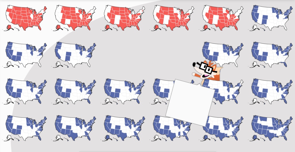
Adding to the sense of flippancy is a new mascot, Fivey, a chipper cartoon fox with Buddy Holly glasses, who explains, “each of these maps is an example of how things might shake out on Election Day.” The message, of course, is that the reader should not get too attached to any scenario in particular, especially given that Fivey Fox’s speech bubble partially obscures four of them. Each time the model is refreshed, Fivey Fox’s background of maps shifts, leaving him and the enunciation “Biden is favored to win the election” as the lone constants. Fivey is the kitty on the motivational poster, an erstwhile pal bellowing “Hang in there!”
Only by scrolling down can the reader find an approximation of the old topline number, though instead of figuring the probability of each candidate claiming victory as a percentage, the site uses a proportion — the operating assumption being, I suppose, that the average reader perceives “78 percent” substantially differently than “78 out of 100.” Those numbers jockey for attention with full-color portraits of Biden and Trump, which float behind 100 colored dots, each of which stands in for one of the possible scenarios under which that candidate prevails, ranging from a Biden landslide to a commanding Trump victory. By floating over each dot with a mouse, it’s possible to see a different electoral map.
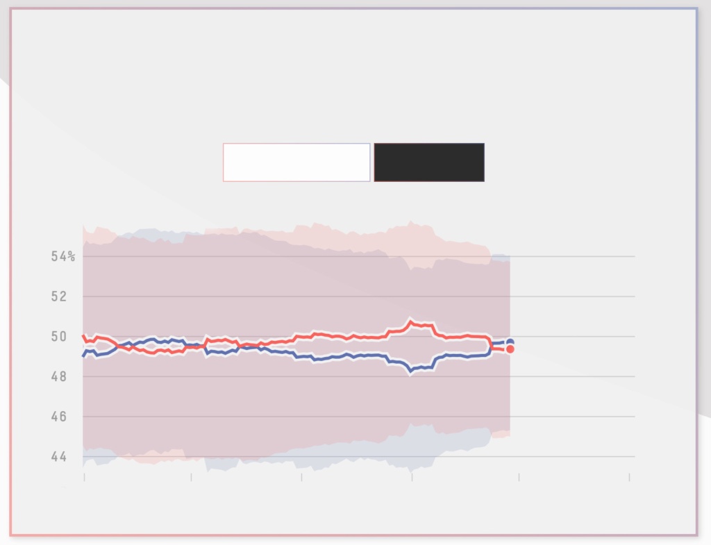
The visuals don’t stop there. A red and blue histogram follows, as does a tracker of the forecast’s changes over time and “the winding path to victory,” a snaking diagram meant to show the range of each candidate’s strength in each state, from cerulean Massachusetts to crimson Wyoming, with slightly rosy Georgia meeting barely bluebell Ohio in the middle. That diagram can be reorganized to show each state’s likelihood of representing the “tipping point,” which is to say becoming the state that delivers the decisive 270th electoral vote to the eventual winner. Clicking over to that visualization shatters the original coil into individual segments, each assigned a percentage of being the state that matters the most on November 3rd.

A Fivey Fox is tagged to each of the model’s illustrations, its commentary ranging from helpful (“As the election gets closer… the forecast will get less uncertain”) to goofy (“Whoa, baby snakes!”). To further underscore the message that all this information isn’t meant to be straightforwardly predictive, the Fivey appended to the model’s topline clutches his own jar of red and blue dots, making them appear more like red pills and blue pills than representatives of individual election outcomes. “Don’t count the underdog out!” this strung-out version of Fivey howls, “Upset wins are surprising but not impossible.” Of course, that’s exactly what happened in 2016, though the popular vote–electoral college split that year — not to mention Trump’s comments, repeated at the first presidential debate on Tuesday, that he wouldn’t accept the results of an election against him as valid — puts a finer point on what an “upset win” can really signify. Fivey Fox’s chummy presence is meant to deflect the distress such a summation might impart, lest all the visualizations of the model total together into a negation of itself.
Still, every time I look through the different electoral-college maps, puzzle over the baby snakes, and click through to the individual forecasts of each swing state, I always find myself scrolling back up to the top of the page. “Biden is favored to win the election,” I read again, and wonder what all these graphs are telling me that a spit-balling CNN pundit couldn’t.
The philosophical shift embodied by the design of this year’s model began with the 11-part dissection of the 2016 election Silver wrote in an attempt to understand the errors that led to the media’s widespread inability (or unwillingness) to think a Donald Trump presidency was plausible. In the capstone to the series, Silver reflects on “errors of interpretation and communication,” which he distinguishes from the “errors of analysis” that characterized competing models that pegged Clinton’s chances of prevailing at 95 percent or higher. It is important to remember not only that “consumers can misunderstand the forecasts, since probabilities are famously open to misinterpretation,” Silver writes, “But people making the forecasts can also do a poor job of communicating the uncertainties involved.” Unsaid is how doing so speaks of a preference among those who already hold power to perpetuate the status quo.
By previously offering a forecast that sought to capture the most likely outcome of the election — a Hilary Clinton win thanks to having squeaked out narrow victories in swing states like Florida, Pennsylvania, and Michigan — Silver seemed to grant in the article that the site had failed to adequately explain that the map that grounded FiveThirtyEight’s forecast that year was only marginally more probable than one in which Clinton lost one of those three states, or in which Trump beat his polls in Wisconsin. Put another way, the design of the model had sanded away too much of the uncertainty that characterizes probabilistic work. While a dutiful reader who scrutinized the entire forecast might notice the histogram that showed that no particular map had more than a 1.5 percent chance of occurring and that Clinton had a one-in-10 chance of winning the popular vote but losing the electoral college, such fine grained thinking was lost in the big topline percentages and tactfully shaded electoral maps.
In a post detailing how the design of FiveThirtyEight’s forecast changed between 2016 and 2020, its lead designer, Anna Wiederkehr, writes “Given the brouhaha after the 2016 election, we knew we had to thoughtfully approach how we delivered the forecast.” That meant not only deemphasizing a topline probability (even as Wiederkehr acknowledges that “no visualization in the forecast received more design attention”), but creating a “clear narrative that helps readers better understand how the election actually works.” That narrative, ultimately, was about refocusing readers from the question of who will win the election to a more holistic understanding of what Wiederkehr calls the “universe of possibilities” the forecast is meant to capture. She includes a generous sampling of the different ways to capture that universe that were toyed with, everything from a version of the current field of colored dots — what Wiederkehr calls the “ball swarm” — in which each one is instead its own, tiny electoral map, to a truly bedeviling set of dancing rectangles.
The biggest change that Wiederkehr’s article charts since 2016 is the shift in FiveThirtyEight’s thinking — rather than its methodology — from the need to present a single map that indicates the relative likelihood of each candidate winning a given state with shading, to the utility of instead offering a barrage of maps that each capture a different final result. The intention, she writes, is to “show the huge range of potential outcomes that would be consistent with the data currently being input into the model. Forecasting an election is more like predicting the weather than predicting whether a coin will land on heads or tails.” It’s not that the model itself has changed all that much, simply that it now is meant to be read in a way that emphasizes the fact that, like the weather, electoral conditions should be read as always being in a state of flux. By the time FiveThirtyEight might be able to predict a tornado touching down, it will already be too late.
The FiveThirtyEight model’s greatest utility, then, is as an expression of this year’s election not as an individual event, but as a moment of infinite possibility — well, as infinite as a universe can be that’s organized around two figures who each ultimately represent one sort of capital interest or another. That redefinition of what predictive modeling is supposed to do may explain why Silver’s work has provoked so much angst among his peers: after FiveThirtyEight released its presidential forecast in August, G. Elliot Morris, who designed the Economist’s model, tweeted a screencap of four of the 32,000 simulated electoral-map outcomes his model had spit out. He followed that up with another screencap that looked something like electoral-map wallpaper, snarking, “Here are 100 more. Fun.” In the weeks that followed, Morris and Silver went back and forth repeatedly about methodology, with other respected political data analysts like the Times’ Nate Cohn also weighing in to question all the novel ways in which FiveThirtyEight was attempting to factor uncertainty into its calculations.
To the outsider, such debates are no more legible than the quarrels within a clique of alchemists over the best method for transmuting straw into gold. Meanwhile, graphic designers like Wiederkehr get to have all the fun: ignoring all the fusty grumbling about out-of-sample cross-validation in favor of joyful visual expression. If the streamlined design of the model Morris built for the Economist draws from the restrained tradition pioneered in architecture by Mies van der Rohe and Le Corbusier, FiveThirtyEight’s ethos is closer to Bjarke Ingels’ more recent maxim, “Yes is more.”
FiveThirtyEight’s post-modernist approach fits well to the program Robert Venturi laid out in his ’60s-era “gentle manifesto,” Complexity and Contradiction in Architecture. There, Venturi calls for design that is “based on the richness and ambiguity of modern experience.” “I am for messy vitality over obvious unity,” he writes, “I am for richness of meaning rather than clarity of meaning.” Such a design philosophy, Venturi remarks, “has a special obligation toward the whole: its truth must be in its totality or its implications of totality.”
Wiederkehr’s “ball swarm” and grids of maps are indebted to that philosophy. The broadness of their scope is in service to an expression of the totality of election-ness, a far more immersive goal than simply delivering an easily digestible percentage. The design of other models is meant to provide a succinct takeaway; the design of FiveThirtyEight’s intends to persuade the reader that no such takeaway is possible, forcing a total reconception of elections as a set of near-infinite variables that can be gestured at, but never totally apprehended. It’s a choice in diametric opposition to the more conventional decision-making behind the Times’ election-night dials, whose spare presentation is meant to funnel the flood of data coming in from all over the country into an answer to one question: Who is actually winning?
Of course, both approaches risk alienating their audience ever further from the paper-and-pen reality of actually casting a ballot. Worse, they may disincentive people from voting at all, even as their intricate design does little to account for conservative efforts to suppress the ability of the historically disenfranchised to get to the polls. The bombardment of maps, graphs, and dials color-coded into every possible saturation of red and blue aestheticizes elections into unrecognizability, creating an impression of them as nothing more than an opportunity to collect a massive amount of data. Whether transmuted into a universe of possibility or a singular indicator, the data becomes the subject, never mind that it is, at its most elemental level, millions upon millions of individuals all taking a few minutes to do something as banal as drop an absentee ballot into a mailbox.
However disconnected from the prosaic reality of politics, there’s something pathbreaking about the effort designers like Wiederkehr are making to take all that data and process it into something beautiful. The most persistent cliché about political journalism is that it treats elections and governance alike as a sport with winners and losers, rather than as the system through which life-and-death decisions affecting millions are made. Our current vogue of data-driven prognostication twists the process in a different direction, out of the realm of zero-sum competition and toward a fine art project. Like all fine art, absorbing probabilistic forecasts answer the core question of “What is it for?” with themselves.
Aside from the post-modern exuberance of the FiveThirtyEight model, politics today looks like the rococo flash and dazzle of the cable networks’ election night coverage, the cryptic normcore of RealClearPolitics and the Drudge Report, the blank canvass of 270towin.com. Each style suggests a different relationship to what politics is, and in the sheer variety of presentations reveals a wider range of opinions on the subject than might be assumed simply from partisan bipolarity. Nevertheless, there are a few constants: maps and numbers, red and blue. These are the aesthetic building blocks of political journalism, as fundamental to its execution as the placement of walls and windows is to architecture.
Aestheticizing politics in this way is not necessarily incompatible with its practice. The most straightforwardly aesthetic vision of Washington is found on television, where the moody lighting and sappy soundtrack of The West Wing fits neatly into that show’s vision of politics as an unglamorous but noble pursuit, while Veep’s clarion-clear production is meant to mirror the slick fakery of a campaign ad in order to emphasize the noxious amorality of its characters. Each show’s look has been carefully calibrated to emphasize a dimension of political reality; similarly, Vox’s appearance as a think tank deliverable sets a tone for politics as a problem to be solved, while the Huffington Post’s insistently bolded headlines suggest D.C. as just another source for gossip about famous people.
All of these attitudes about politics are correct. It’s as weighty as it is frivolous, as high-minded as it is petty. If the rise of election modeling marks a departure, it is only because the expression of these judgments is no longer happening along the margins, in the easily overlooked language of image size and layout. For FiveThirtyEight and its competitors, design is the main event: rather than subtly nudging the reader’s understanding one way or the other, it governs everything.
This year’s FiveThirtyEight’s model has ruffled feathers in a similar way to how the quivering needle the 2016 Times did, but that’s only because each represents a distilled vision of politics that can’t possibly suit all of its devotees. How can a politics expressed as a universe of possibility be “won”? How can those who prefer a different outcome be satisfied when the dial points inexorably away from the future they believed was inevitable? These questions can’t be answered by a system like ours, which explicitly avoids the direct democratic election of presidential candidates at all costs, instead advantaging rural states out of bizarre deference to the 18th-century requirement that voters own land. The democracy we’ve been able to eke out of a constitution that was designed by and for aristocratic slavers is a limited one, and thus well served by the circumscribed bipolarity of contemporary politics. If looking at red and blue graphs, charts, and maps makes you angry, it’s only because they are so far removed from the abolitionist, demotic version of America that lives only in our minds. After all, if the person who garnered the most votes always won, there’d be no reason for a forecast at all: a simple national poll would do.
Unlike with a Washington Post article that treats a random person at a donut shop in Iowa as the nation’s tribune or some Axios dispatch that triumphs over having secured exclusive access to an inconsequential bit of White House hiring news, analytical political coverage includes no editorial framing to contest, no reportorial schmoozing to object to. There is only colors, maps, and numbers. The images assert themselves as objective truth, even as they reflect as narrow an expression of it as any news article or Instagram post. However powerfully predictive they claim to be or enthralling their design, these models are just one more expression of politics as an inhuman force, one whose aggregate holds only the most fleeting connection to the experience of filling out a piece of paper at the local elementary school and feeding it into a machine.